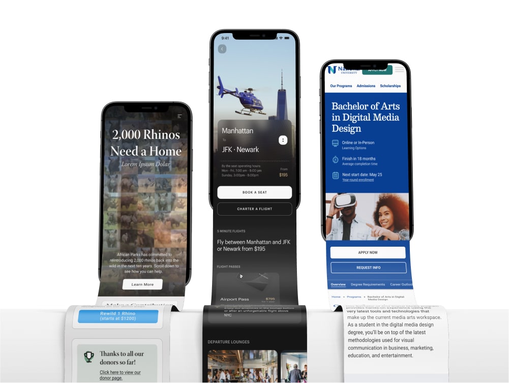
Redesigning the BLADE Mobile App
I led the redesign of the BLADE native mobile app, rethinking the booking flows and user experience from the ground up. The design overhaul also encompassed an entirely new styling of UI components.
Role:
Lead Product Designer, BLADE
Company:
BLADE Air Mobility
Project Type:
Native Mobile App
Timeframe:
Jan 2024 - Sep 2024
Team:
Initial UI Kit Designs by Metalab
Development Agency: Very Good Ventures
Blade Project Manager: Dave DeCourcelle
VGV Management Team: Kevin Burns, Tanesha Smith-Wattley
VGV Design Team: Marco Murguia, Josh Musick
Developers: Lucas Berger, Marcos Sevilla
Project Overview
Summary
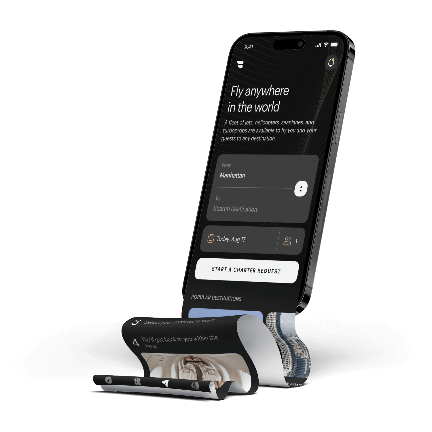
A new native mobile app for the "Uber for Helicopters"
BLADE is a publicly traded company that sells by-the-seat and charter flights through a number of different products and markets, primarily in the US and France. By-the-seat flights from Manhattan to the Airport or the Hamptons, as well as between Nice and Monaco in France, are core product offerings.
The Problem
An outdated app, and some unintuitive booking flows
The existing BLADE app had evolved organically over time, and the leadership team saw an opportunity to better align the app's aesthetic with BLADE's premium brand positioning. Additionally, several booking flows could be streamlined to improve the user experience.
Hypothesis
Redesign for engagement and understanding
Creating a more intuitive and aesthetically pleasing native app would significantly improve the experience for both current and new users. In creating an easier and more enjoyable app, we can ultimately increase conversions and reduce the need for customers to call in about their bookings.
Building A UI Kit
When I came onboard at BLADE there had already been initial branding and UI work done by outside consultancy Metalab, which has worked on some similar products including Uber. They had provided a UI kit which laid out some fundamentals about the look and feel of components throughout the app, but it was clear that a lot of supplemental design work was needed beyond this initial set of components to be applicable to BLADE's wide range of product offerings. Additionally, as the project progressed, various technical considerations required me to redesign or extend these components.
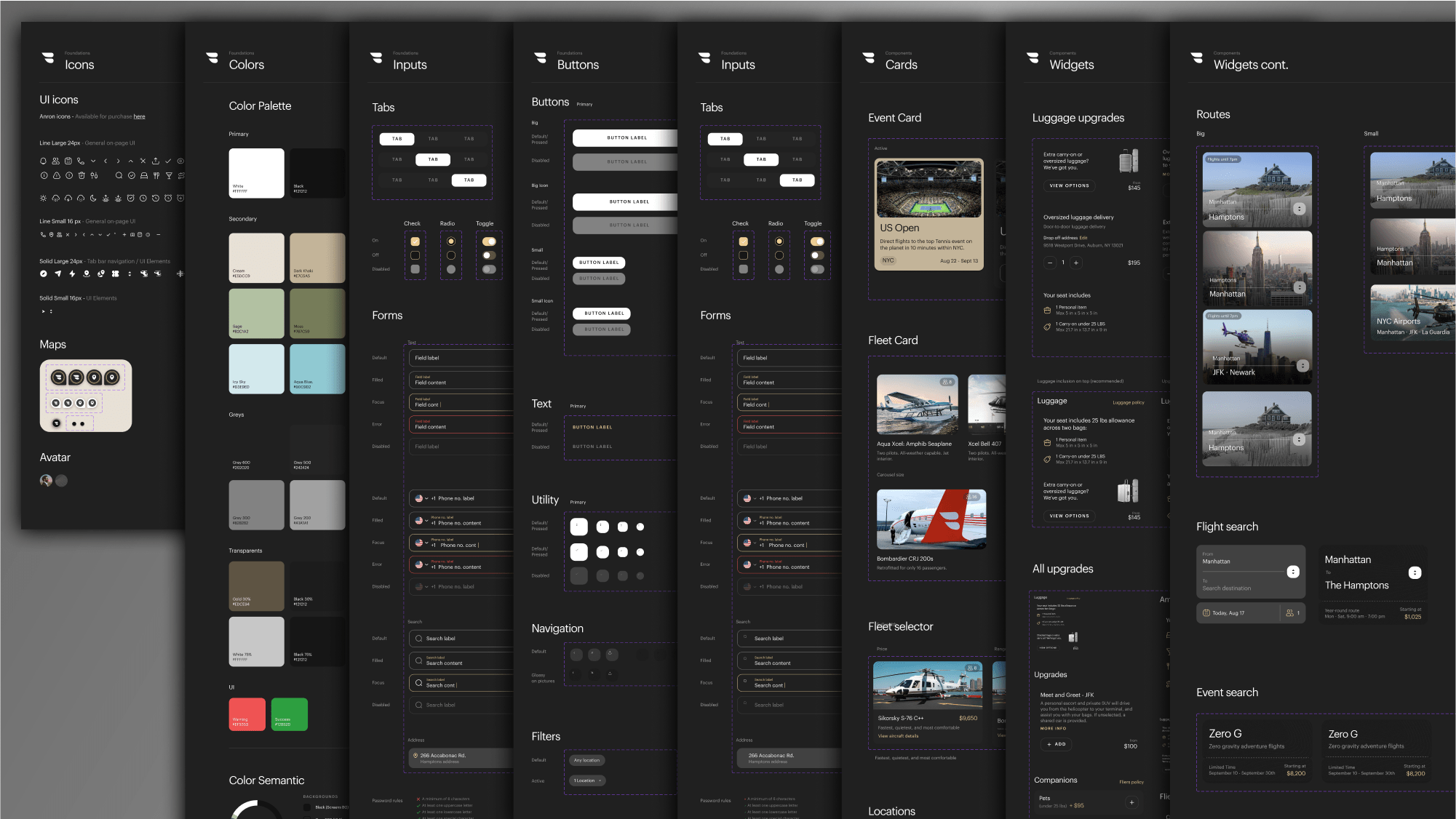

A portion of the final UI kit used in development. While the initial UI kit offered a great vision and design language to build on, many components and flows needed to be updated to reflect the reality of the product, and evolved significantly over the course of the project.
Designing for unique product booking flows
I began to think about the existing booking flows that were present in the BLADE app, and how they would need to be adapted to fit the new app designs. Additionally as I went through I tried to identify where the designs could be unified (what screens and components are reusable), and what booking flows required components that were unique. I started by mapping out the different core product offerings into 8 different booking flows:
Airport Flow
Book by-the-seat flights or charter flights between Manhattan and NYC Airports.
Hamptons Flow
Book by-the-seat flights or charter flights between Manhattan and various locations in the Hamptons.
Nice - Monaco (FR)
Similiar to Airport in NYC, but catering a similiar route in France, between Nice and Monaco, which had distinct needs.
Panoramic Tours (FR)
Offered scenic helicopter tours of the French Riviera, departing from Cannes, Monaco, or Saint-Tropez.
Montauk Flow
A dedicated product offering by-the-seat flights between Teterboro airport in New Jersey and Montauk in the Hamptons.
Charter Flow
In addition to core product offerings, BLADE offers the ability to charter flights anywhere in the world.
Limited Time Events
BLADE often offered by-the-seat flights to sporting matches, or special dinners. These events could have vastly different booking mechanics and features.
Seasonal Routes
Some by-the-seat routes would be offered on a seasonal basis, to areas such as South Florida.
These core products offered plenty of challenges from the get-go. Different routes had different upgrades, features, and restrictions. French routes also had different legal obligations and regulations to contend with that required dedicated designs. Lastly the "Limited Time Events", and "Seasonal Routes" consisted of an important but widely varying assortment of offerings, that were currently hard-coded into the website on an individual basis. I would have to come up with new designs, as well as a new way to think about the backend systems we were building so that these systems could be flexible enough to be future-proof while also offering a repeatable template we could apply going forward.
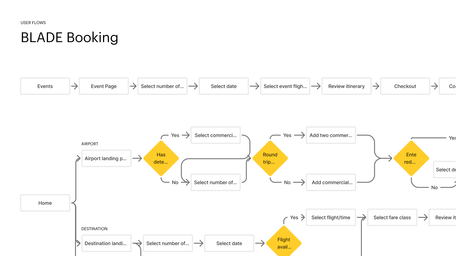
User flow diagrams were used early in the process to align on the progression of these flows and how they would vary from product to product.
Identifying user pain points or room for improvement
I began to work through the existing flows that existed in the app, and tried to identify points of friction where design could aid the user journey. I also consulted user feedback that had been collected through internal systems, as well as live user click analytics and heat maps through the service Hotjar.
I identified many points where the flows had considerable room for improvement and clarification.
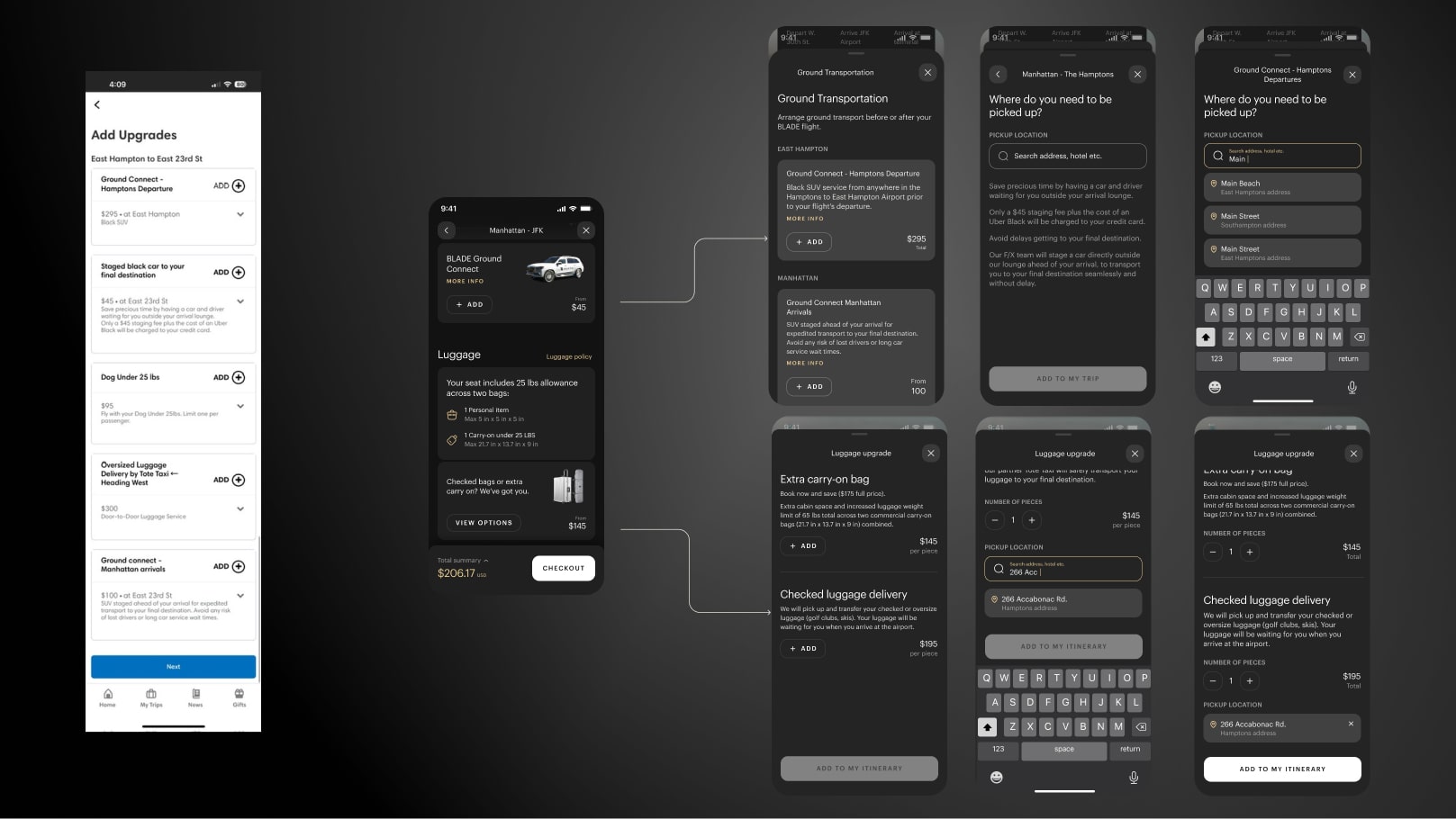
The existing upgrades screen made no distinction when organizing upgrade types, or which side of the journey (origin / destination) they fell on. The redesigned app groups all luggage or ground transportation upgrades into individual sheets, which then guide users through a focused flow to add these upgrades.
The design evolution
We went through a number of internal iterations of the designs while we refined functionality for the new flows along with the visual direction. The new designs have a much more polished feel, as well as introducing new ways of interacting and understanding the product.
For instance the home page and landing pages (seen in the top left of each group below), introduced a new format for displaying products which eliminated paragraph copy, and introduced a direction switcher and vehicle tag to communicate the type of journey, and that it was bookable in either direction (something that testing had found was a point of confusion).
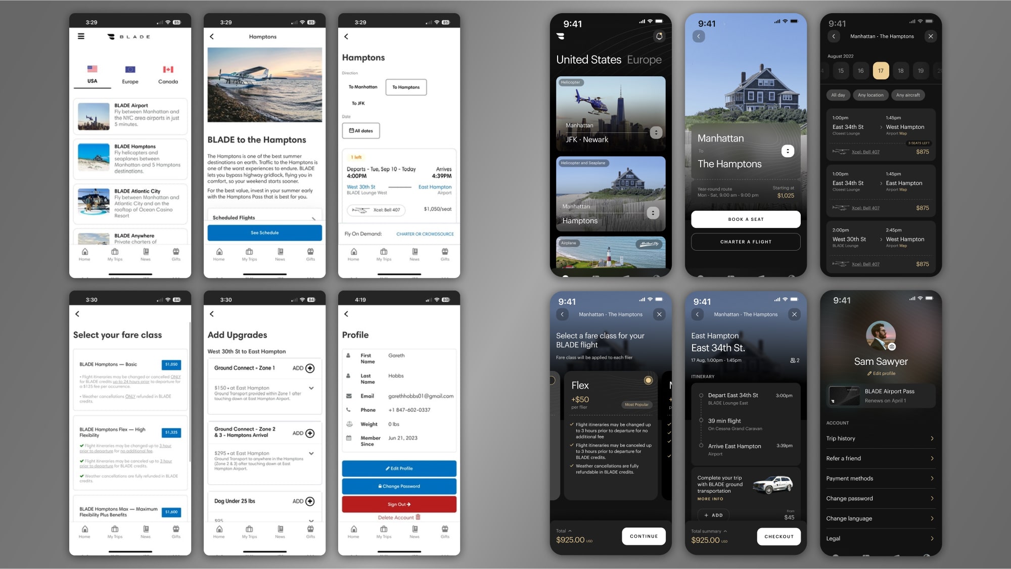
The existing designs (left) next to the new redesigns (right)
Designing for development bottlenecks
As the design process progressed, I worked closely with the BLADE development team to understand the existing API architecture and identify opportunities to improve data consistency across the app. This collaboration helped us prioritize which features could be implemented in the initial launch versus a V2 release. More so than on previous projects I have worked on, I became closely involved in the conversations about how to develop these backend systems, and what we needed to prioritize for the new design features.
When necessary, the designs were simplified so that the dev team could focus on the higher priority API updates, and some features were moved to a V2 to expedite getting our redesign to market.
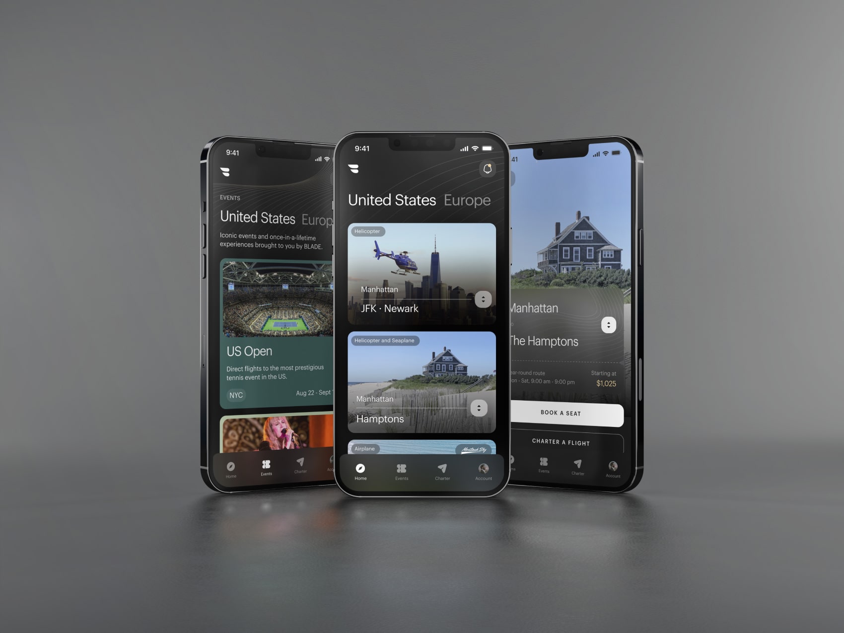
Final Designs
The final designs for the new BLADE app offered a clear upgrade for the brand. The designs have a much more premium feel that aligns with a luxury travel brand. Functionality was greatly improved by giving users a more easily digestible overview of BLADE's different product offerings, as well as improvements to the core booking flows.
Before and After: Selected Screens
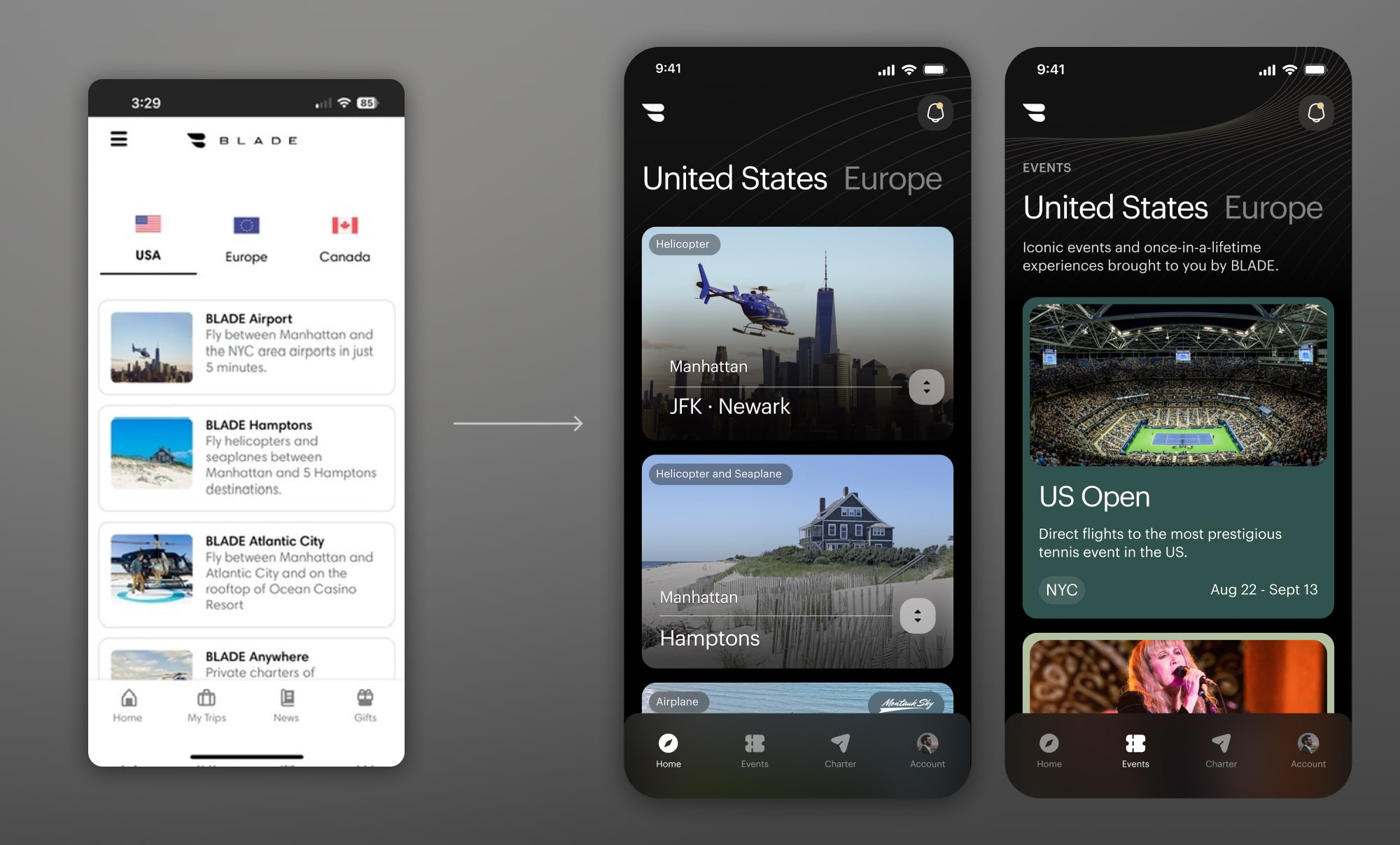
Home screen discovery flow
The existing product grouped all core routes along with seasonal events, and special offers (such as the merch shop and flight passes) on a single list of tiles on the homepage. This made it more difficult for users to quickly identify and understand BLADE's products. The redesign simplified the route cards, and put events in a separate tab.
.jpg)
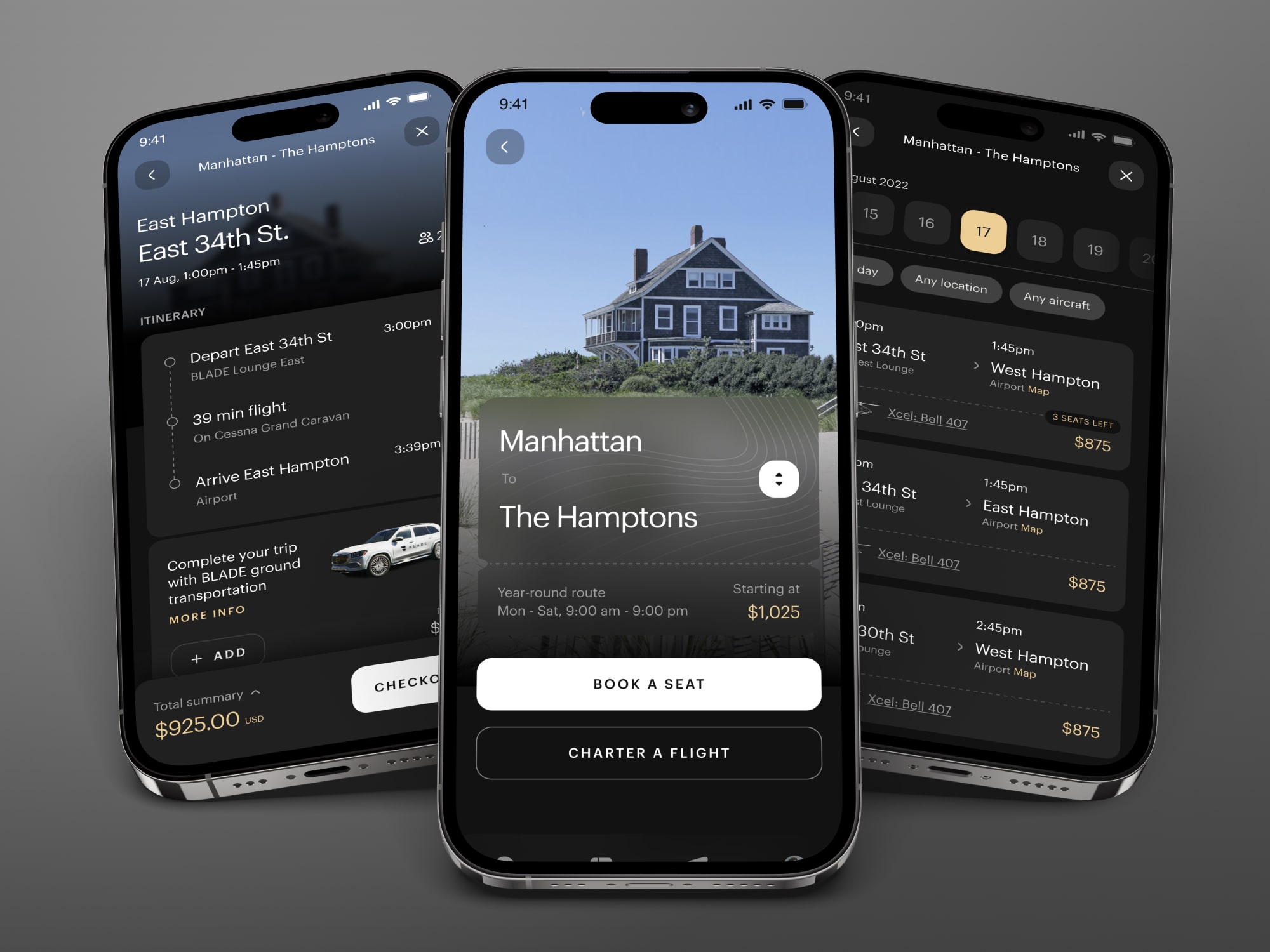
Itinerary and Upgrades
What previously was two screens became one, eliminating an extra click from the flow. The new itinerary and upgrades screen offered more helpful information (such as an expandable cart), and better organized ground transportation and luggage upgrades to reduce cognitive load.
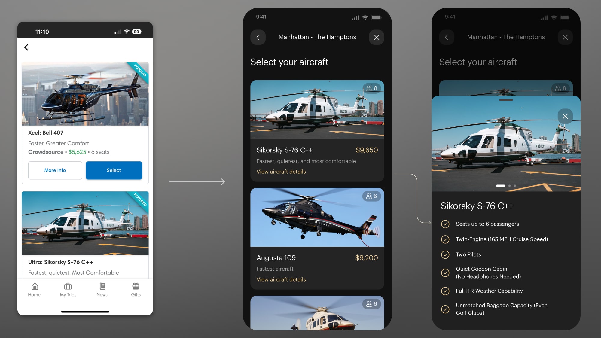
Aircraft selection
The new charter aircraft selection screen utilized a bottom-modal overlay to give more information about their choices. This pattern was used throughout the redesign to offer extra information while keeping users' focus on the central flow.
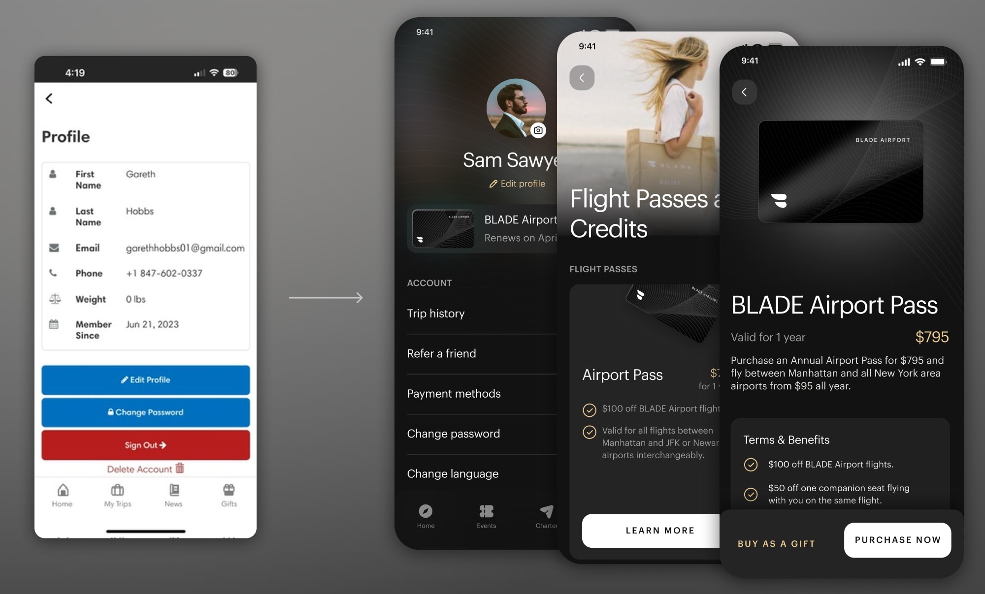
Profile and Flight Passes
The heavily redesigned profile page becomes a central hub for useful information such as flight passes - a central business consideration at BLADE which was lacking a well defined purchasing flow.
Project Takeaways
The redesign of the BLADE mobile app was the largest and most involved design process I have been part of to date. I learned a lot working closely with a number of different teams, both within the company at BLADE and with an outside development firm.
This project reinforced the importance of early technical discovery and cross-team alignment. In future projects, I'd prioritize even earlier collaboration between design and engineering to ensure we have a shared understanding of technical constraints and implementation timelines from day one.
Interested in working together?
Have a project I can help with? Have a question about something on my website? Reach out using the form below, or send me an email.