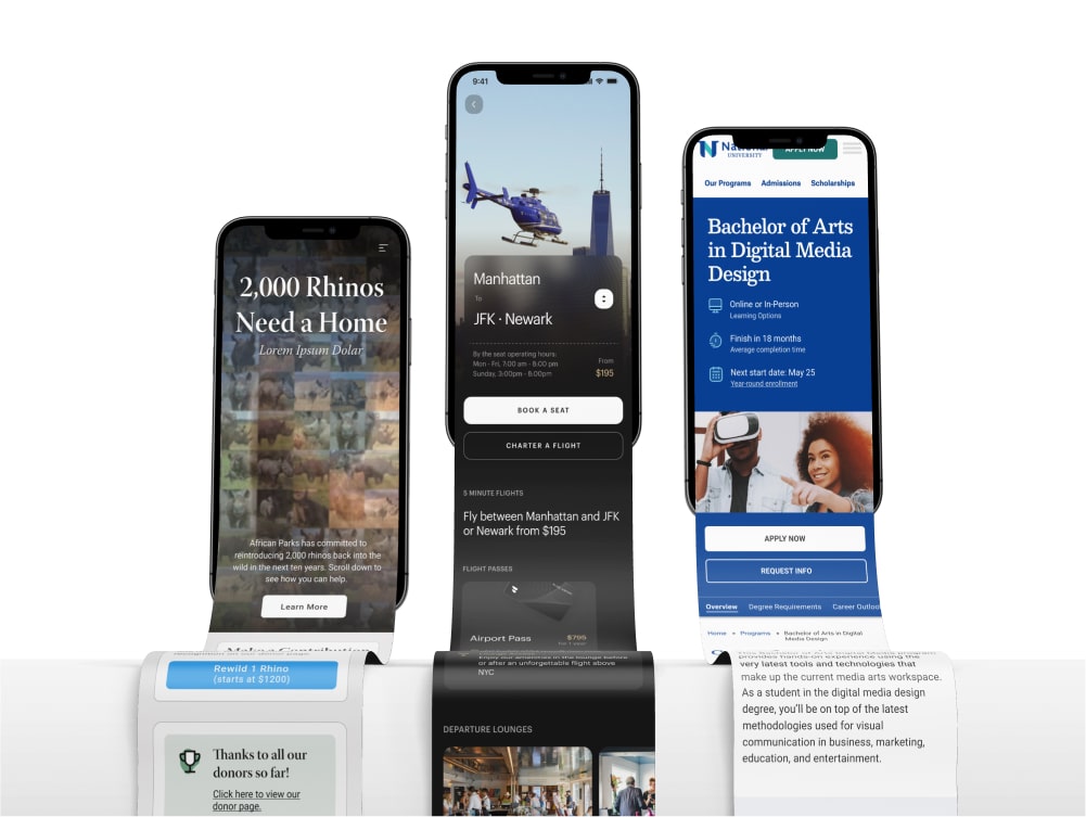
National University
Since early 2023 I have led the design or redesign of a number of projects for National University through my role as a product designer for the digital agency Brick Factory.
My role:
Product Designer
Company:
National University
Project type:
Website / Web App
Timeframe:
May 2023 - Aug 2024
Team:
Agency: Brick Factory
Project Managers: Morgan Williams, Michael Roberts, Beth Bucciferro
Additional Design: Tom McCormick
User Testing: Danielle Anthony (National University)
Redesigning Academic Program Pages
Summary
Redesign the landing pages that present information about National University degrees.
National University had a live version of this page that was used for different degrees across their site.
The Problem
The page layout could make it difficult to obtain important information.
Some sections, such as course details, were called out early in the process as needing a design overhaul. The rest of the page was also put forward for rethinking.
Hypothesis
Giving users better information, more easily, will lead to higher conversions.
NU has a lot of live data about how their program pages convert, and where users may be falling off. Our overall goal was to improve conversion metrics for users requesting information, or starting an application.
Looking for areas of improvement in existing designs
I began the process by identifying points in the current program pages that felt confusing, redundant, or had a UI that impeded easy access of information.
Course Details Section
The course details section was identified early on a a key pain point for users.
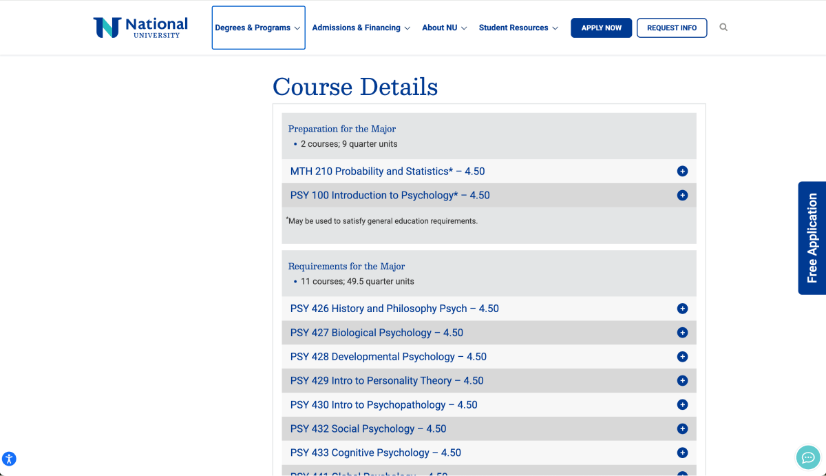
The existing course details section was difficult to scan for information, and to interact with.
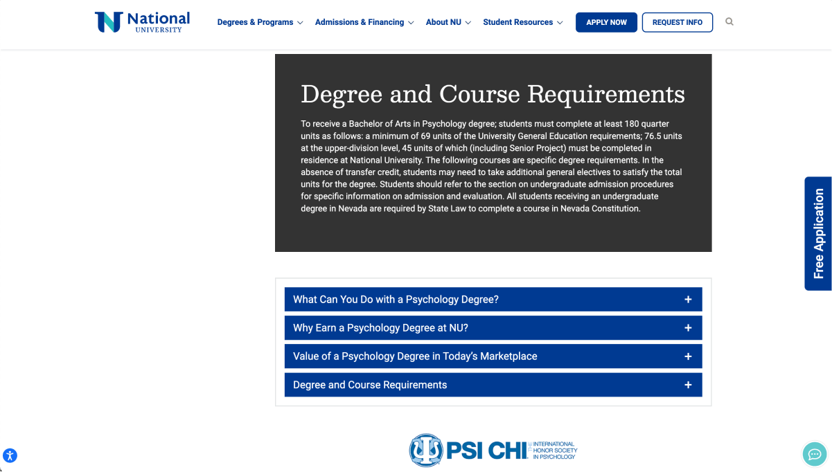
A section about degree and course requirements was disconnected further down the page, and the block paragraph text was not formatted to be easily readable.
Redesigned Course Details Section
I decided to combine these two sections, as well as rewrite and reformat the text to make it more easily understandable. For the actual course description content, I added new section headers that made it clear which stage of learning different courses fell under. I also used a two column pattern, color, and typographic hierarchy to create a system which was easily scannable while containing all the same information.
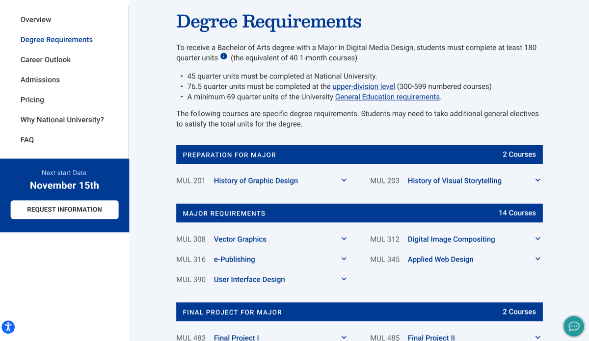
My redesigned course details section (now just called "degree requirements") sought to improve high level understanding and be more easily digestible. A sticky panel on the left further improved in-page navigation and featured a clear CTA.
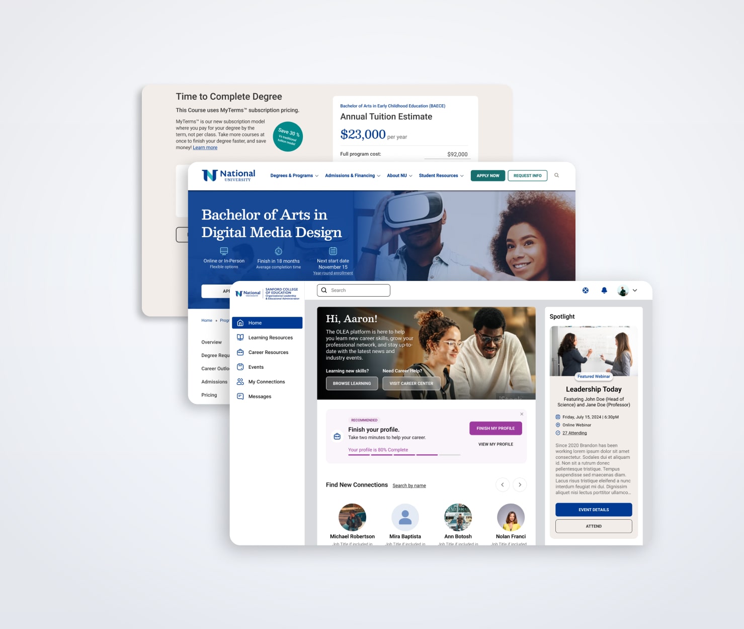
Redesigning Hero Content
I identified the hero section as another key area for improvement. There was a confusing mismatch of text hierarchy in the hero, and some missed opportunities to highlight key value props that National University offers in their degrees. Additionally, important information like start dates and tuition were difficult to locate.
Existing Homepage Hero
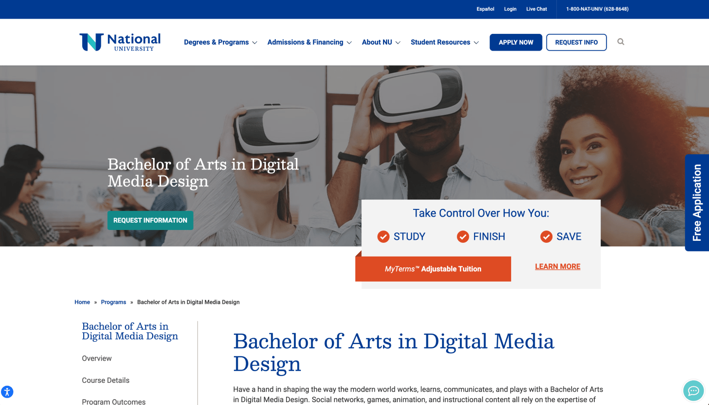
The existing program page hero section.
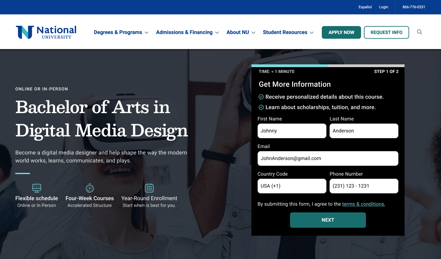
Redesigned Homepage Hero

The redesigned hero section features clearer hierarchy, value propositions, better CTA's, and a quick-facts section that gives important info at the top of the page.
Incorporating User Testing
User tests were run at a number of points throughout the process, to validate design decisions, or identify areas for further improvement. The first round of this dealt primarily with exploring different hero section patterns, before we ultimately arrived at the final designs seen above.

In earlier iterations of the program page we explored using a form incorporated into the hero section in an attempt to improve conversions. Ultimately this direction was discarded due to lower ratings in user preference studies.
User Testing Completed Designs
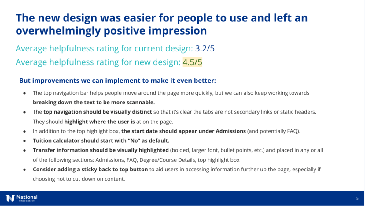
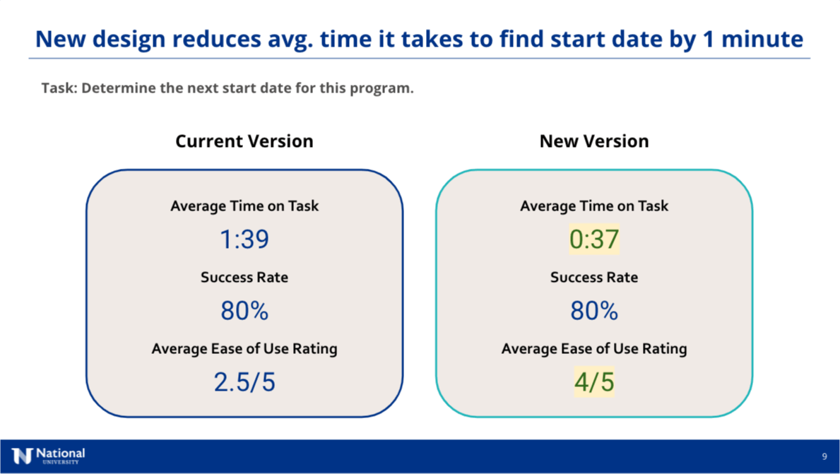
User testing studies were run comparing the current version of the pages to the new designs.
Credit: Danielle Anthony
The new designs were found to significantly improve usability and user opinions across a number of metrics. Some areas for improvement were also identified which were incorporated into the next round of design edits.
Credit: Danielle Anthony
Specific user journeys were tested on the old and new designs, to make sure that users were accessing the information that they needed.
New Sections and Features
In addition to rethinking a number of existing sections on the page, new sections were also created that incorporated new functionality, or more effectively communicated content.
Career Outlook Section
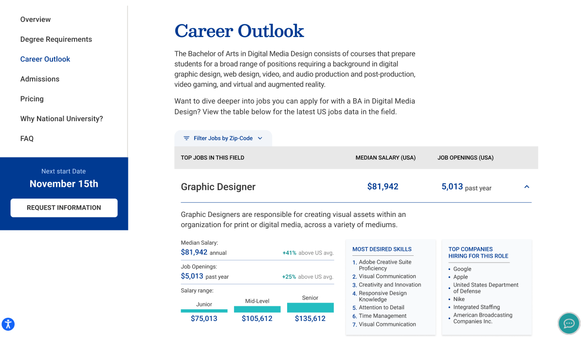
The new "Career Outlook" section grew out of a desire to give prospective students better data about the careers they could move into with their degree. This feature incorporated data pulled from Lightcast's API.
"Why Study with Us" section
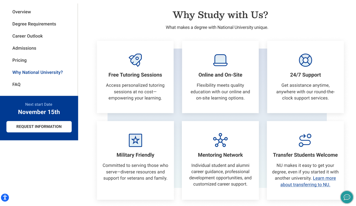
The 'why study with us' section sought to portray key value propositions in a more organized and central way. Much of this information had been scattered amongst different sections or hidden in paragraphs.
Tuition Estimator Widget
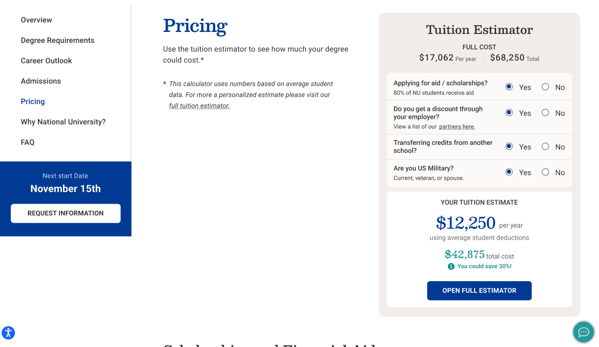
The tuition estimator widget was created as a small on-page variant of the full tuition estimator that National University has to estimated tuition reductions (a separate design project I led a redesign of). This short version sought to give users a quick estimate based on some brief yes/no questions.
Final Designs
The final designs for the National University program pages represent a clear improvement over the existing designs, a conclusion supported by robust user testing that was run during the process.
.jpg)
Interested in working together?
Have a project I can help with? Have a question about something on my website? Reach out using the form below, or send me an email.