Trinity Organ Transport Dashboard
I designed the customer-facing dashboard for Trinity's organ transport logistics platform, enabling transplant coordinators to submit and track time-critical organ transports without relying on phone calls, eliminating manual data entry errors, and providing real-time visibility for hospitals and administrators managing multiple active cases simultaneously.
My role:
Lead Product Designer
Company:
Trinity Medical Solutions
Project type:
Web Application Dashboard
Timeframe:
2024, with refinements in late 2025
Team:
Product Managers: Mark Jaycox, Dave DeCourcelle
Development Lead: Aaqil Khoja
Project Overview
Summary
Real-time logistics platform for organ transplant coordination
Trinity Medical Solutions coordinates the transportation of organs, medical teams, and specimens for transplant procedures across the United States. Every transport is time-critical. Organ viability windows are measured in hours, and delays can mean the difference between life and death.
The Problem
Create a web interface for creating and monitoring transplant orders.
Hospital coordinators still relied exclusively on phone calls and emails to request transports and track their status. The manual process created multiple pain points:
- For clients: Time-consuming phone calls during emergency situations when every minute counts.
- For Trinity Staff: Manual data entry for every request, increasing the risk of errors in time-critical logistics.
- For both: Frequen status update calls, pulling staff away from coordinating transports,
The business case was clear: a self-service portal would eliminate communication bottlenecks and reduce operational overhead, but only if it could handle the complexity of multi-leg, time-critical medical logistics."
Hypothesis
Strategic design could transform emergency logistics
By redesigning the platform with a focus on information hierarchy, progressive disclosure, and intelligent real-time tracking, we could reduce coordinator workload, minimize errors in time-critical situations, and provide the visibility needed for confident decision-making.
Mapping the complexity
Before redesigning anything, I needed to understand the full scope of what Trinity's system needed to handle. I worked closely with the product and operations teams to map out the workflows, constraints, and edge cases.
The system had to manage:
Multiple service types
- Organ transport (hearts, kidneys, livers, lungs, pancreas, etc.)
- Medical team transport (surgical teams traveling to retrieve organs)
- Specimen transport (tissue samples, blood work)
Complex logistics
- Multi-leg journeys combining ground and air transport
- Real-time tracking across all legs
- Regulatory compliance (UNOS IDs, tissue tracking numbers)
- Medical team requirements (weights for aircraft calculations, dietary restrictions)
Time-critical decisions
- Organ viability windows (some organs have only 4-6 hour windows)
- Cascading schedule impacts (if leg 1 is delayed, all subsequent legs shift)
- Urgent status updates for coordinators managing multiple active transports
Multiple user types
- Hospital transplant coordinators (primary users, B2B clients)
- Medical teams (viewing their own transport status)
- Pilots and drivers (navigation and logistics details)
The existing system displayed this information, but without strategic design thinking applied to how users actually needed to work.
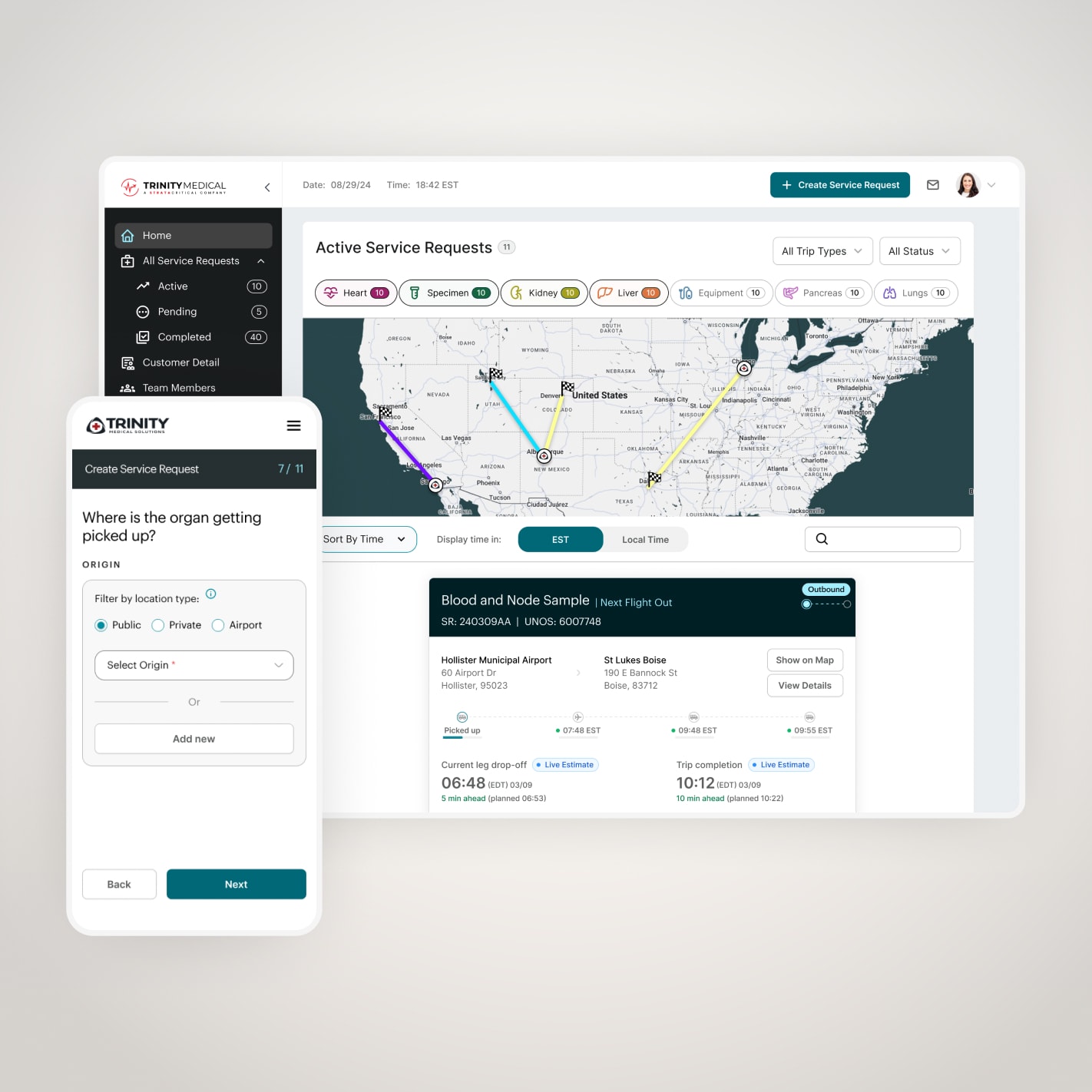
From overwhelming forms to progressive disclosure
The existing service request flow was a two-column layout with numerous input fields all visible at once. For coordinators trying to quickly submit a life-saving transport request in an emergency situation, this created unnecessary cognitive load and increased the likelihood of errors—a critical concern when incorrect pickup addresses or missing medical team information could delay procedures.
I redesigned this as an 11-step progressive flow, with each step logically grouped around a specific aspect of the request:
1 Customer info
Basic contact details
2. Template selection
Choose from saved templates for repeat routes (a time-saving feature I introduced)
3. Service type & organ selection
What's being transported, with conditional fields based on selection
4. Pickup timing
ASAP vs scheduled, with intelligent defaults
5.Additional details
Donor type, emergency equipment needs
6. ID Information
UNOS numbers, tissue IDs, regulatory compliance
7. Team Members
Add medical team with weights (required for aircraft planning)
8. Origin location
Where the organ/team is being picked up
9. Desination location
Where they're going
10.Notes and Files
Add files and notes for the team.
11. Review and submit
Summary before submission, with option to save as a template.
Key Design Decisions
Template system
I recognized that hospitals often request similar routes repeatedly (e.g., a major transplant center might frequently send teams to the same regional hospitals). By introducing a template system early in the flow, power users could skip ahead and only modify what's different, potentially saving 5+ minutes per request.
Conditional logic
Different service types require different information. Organ transport needs tissue IDs; medical team transport needs passenger details. The flow adapts based on earlier selections, reducing clutter and preventing errors.
Map integration for locations
For origin and destination entry, I integrated map search and validation. In time-critical logistics, address errors could be catastrophic. The map provides visual confirmation while users are still in the flow.
Mobile optimization
While primarily desktop-focused, I ensured the progressive disclosure approach worked on mobile for coordinators on the go or pilots checking details in the field.
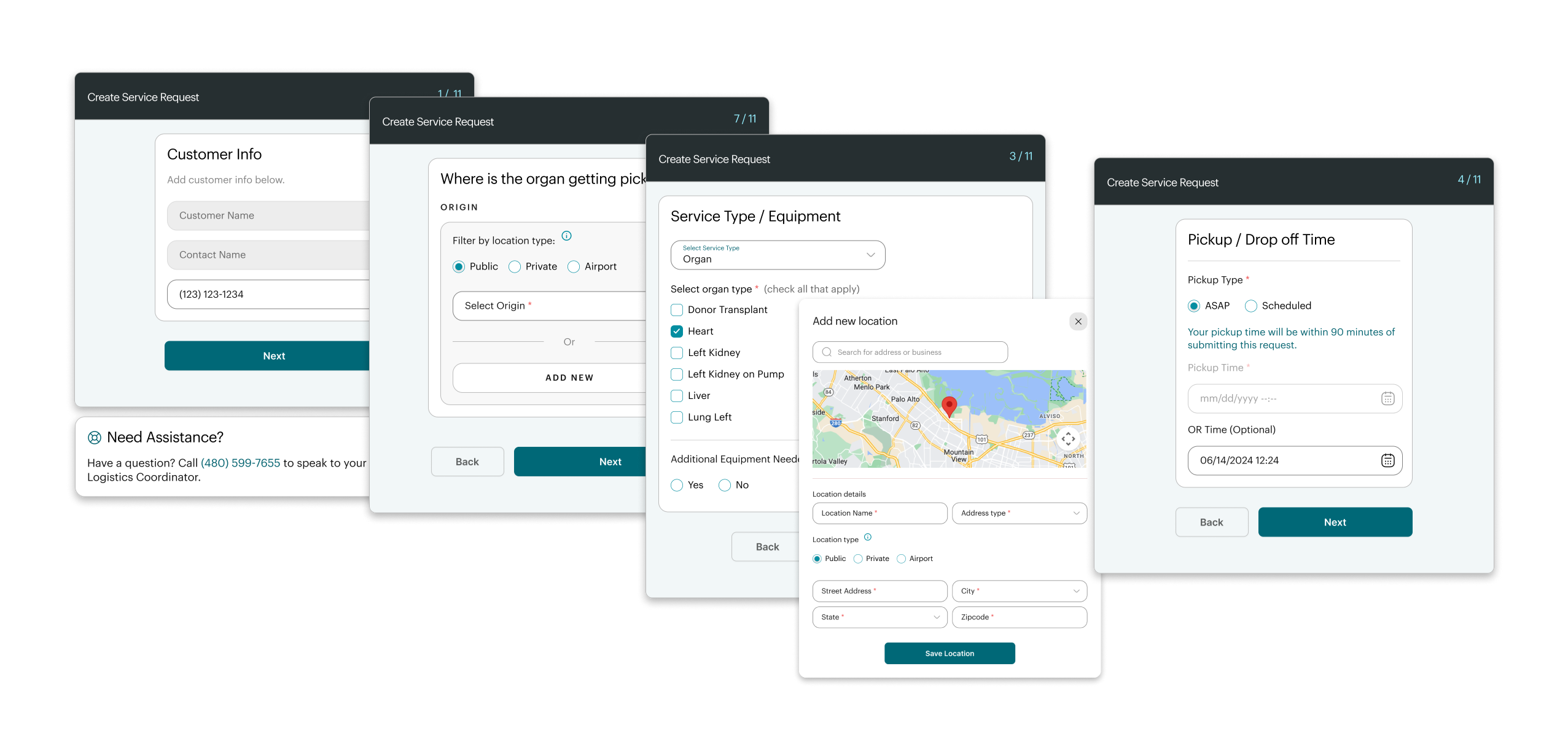
The flow for creating a service request was broken down into a number of simple steps, to reduce cognitive load and improve clarity.
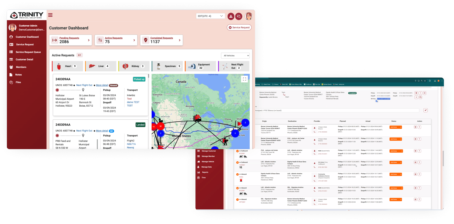
Designing for time-critical decision making
The homepage needed to serve as a command center for coordinators managing multiple active transports simultaneously. I reorganized the information architecture to prioritize what matters most: what's happening right now.
Information hierarchy decisions:
Active requests front and center
The dashboard defaults to showing only currently active transports—organs and teams that are in motion. This is the most time-sensitive information. Pending and completed requests are accessible but secondary.
Visual filtering by organ type
Large, icon-based filter controls at the top allow coordinators to quickly isolate specific organ types (hearts, kidneys, etc.). During emergency situations, being able to instantly see "where are all my active heart transports" is critical.
Map overview with color coding
Each active transport is shown on a map with its route. I introduced a color system:
- Teal for "Outbound" - Team is traveling TO retrieve the organ
- Yellow for "Inbound" - Team HAS the organ and is returning
This visual distinction is important because these represent fundamentally different workflows. Outbound follows a planned schedule; inbound is "as fast as possible" once the organ is secured.
Compact card design with key information
Each transport card shows:
- Service request ID and organ type
- Origin and destination with addresses
- Visual leg indicators (car/plane icons showing transport segments)
- Current status and next milestone
- Timing information (planned vs. live estimates)

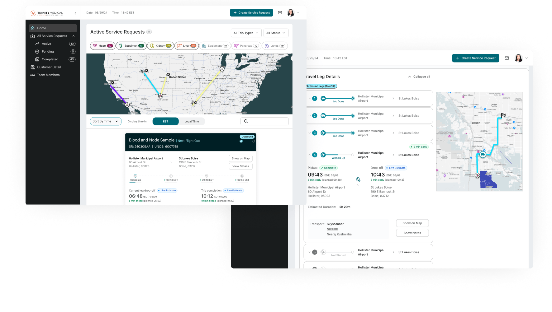
The ETA cascade logic system
One of the most complex design challenges was handling real-time updates to estimated arrival times. This required strategic thinking about how to represent system state, not just display data.
The problem: When a service request is created, coordinators enter planned times. But once the transport starts, reality sets in: traffic delays, weather, aircraft availability. If the first leg is delayed by 20 minutes, every subsequent leg's timing shifts.
The solution - intelligent status badges: I designed a system of status indicators that automatically adapt based on GPS tracking and route calculation:
"Planned" (gray badge) Before the leg starts—these are estimated times entered during booking
"Live Estimate" (teal badge with dot icon) Once GPS tracking is active, the system calculates real-time arrival based on current location and traffic. The animated dot reinforces the "live" nature of this data.
Time variance indicators:
- Green: On schedule (within 5 minutes)
- Yellow: Moderate delay (5-15 minutes behind)
- Red: Significant delay (15+ minutes behind)
Outbound vs. Inbound logic:For outbound legs (going to get the organ), these time estimates and variance indicators are relevant because there's a planned schedule.
For inbound legs (returning with the organ), the concept of "on time" becomes irrelevant—the goal is simply "as fast as possible." So for inbound transports, I simplified the display to show only the most critical information: when are they expected to arrive at the final destination?
This distinction reflects an understanding of the actual workflows and what coordinators need to know in each scenario.

A variety of different states shown for the expanded "leg details card", to account for all scenarios.
Progressive disclosure at the journey level
Clicking into any transport card takes users to a detailed view where they can see the full picture of the journey.
Trip progress visualization:
A horizontal timeline shows all legs of the journey at a glance:
- Completed legs (with actual completion times)
- Current leg (with live GPS tracking)
- Upcoming legs (with estimated times)
Users can expand or collapse the "Travel Leg Details" section to see:
- Specific vehicles and tail numbers
- Pilot/driver names
- Exact pickup and dropoff locations
- Duration estimates
- Route map for each leg
Real-time updates
As the transport progresses, the interface updates automatically:
- GPS position on the map
- "X min early/late" indicators
- Completed leg timestamps
- Updated ETAs for subsequent legs
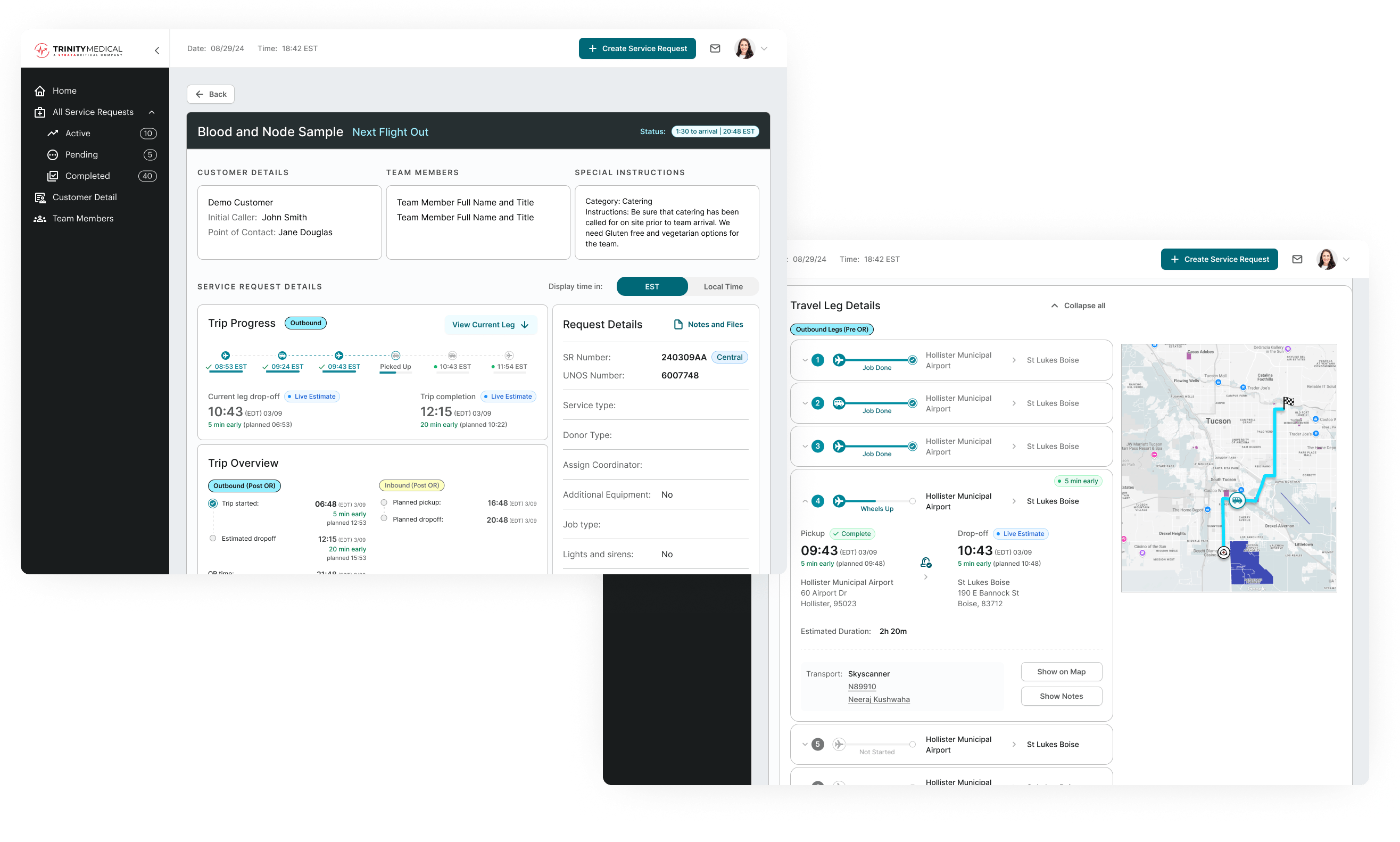
The trip details screen shows all in-depth information for a request, as well as a detailed itinerary view.
The transformation from functional to strategic
Before: The existing dashboard prototype (2024)
The look of the proof-of-concept prototype (for internal testing) when I came on board the project.
The original interface showed some information but without strategic design:
- Dense, text-heavy cards difficult to scan
- No visual hierarchy or color coding
- Map cluttered with all transports simultaneously
- No intelligent status differentiation
- Buried information requiring excessive clicking
After: The redesigned system
The redesigned system prioritizes decision-making:
- Clear visual hierarchy with status badges
- Intelligent color coding for outbound/inbound
- Filterable map with route visualization
- Progressive disclosure reducing cognitive load
- Real-time updates with variance indicators
Project Takeaways
Redesigning Trinity's organ transport dashboard was the most complex systems design challenge I've taken on. The project required me to think not just about visual design, but about how to represent time-critical, multi-stakeholder workflows in a way that supports confident decision-making.
Key learnings:
Context determines everything
The same piece of information (arrival time) needs to be displayed differently depending on context (outbound vs. inbound, planned vs. in-progress). Understanding these contextual differences was essential to designing an effective system.Progressive disclosure scales
Whether it's an 11-step service request flow or expandable travel leg details, breaking complexity into digestible chunks allows users to work efficiently without being overwhelmed.Design for the edge cases
In time-critical medical logistics, edge cases aren't rare—they're daily reality. Designing for delays, cancellations, route changes, and emergency updates from the start created a more robust system.Real-time systems require different thinking
Unlike static interfaces, real-time dashboards must communicate system state, not just display data. The cascade logic, status badges, and color coding all work together to help coordinators understand "what's happening now" at a glance.
System Impacts Delivered
- Shift service requests online, eliminating phone-based booking for routine transports
- Provide self-service status tracking, reducing coordination overhead for internal staff
- Handle edge cases systematically (delays, cancellations, route changes) that previously required manual intervention
- Scale operations with a system designed to support Trinity's growth.
Interested in working together?
Have a project I can help with? Have a question about something on my website? Reach out using the form below, or send me an email.